Button
This component generates a default button.
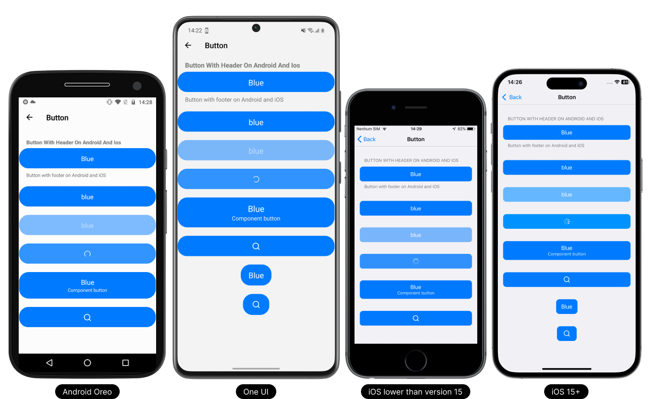
- Light Theme
- Dark Theme

Usage
- TypeScript
- JavaScript
import React from 'react';

// React Native UI DevKit
import { Button, IButtonProps } from 'react-native-ui-devkit';

const App = () => {
  const _item: IButtonProps = {
    title: 'Button',
    onPress: () => { }
  };

  return (
    <Button data={_item} />
  );
}

export default App;
import React from 'react';

// React Native UI DevKit
import { Button } from 'react-native-ui-devkit';

const App = () => {
  const _item = {
    title: 'Button',
    onPress: () => { }
  };

  return (
    <Button data={_item} />
  );
}

export default App;
Props
data
This property receives an interface for configuring the button.
Type:
IButtonProps
header (optional)
Inserts a native header into the button. For use on Android, set headerOnAndroid equal to true.
Type:
string
headerOnAndroid (optional)
If you want to render the header on Android, set it to true.
Only supported Android.
Type:
boolean
footer (optional)
Inserts a native footer into the button. For use on Android, set footerOnAndroid equal to true.
Type:
string
footerOnAndroid (optional)
If you want to render the footer on Android, set it to true.
Only supported Android.
Type:
boolean
icon (optional)
Set the button as an icon button. Widely used in headers.
Type:
boolean
blue (optional)
Sets the button to blue.
Type:
boolean
gray (optional)
Sets the button to gray.
Type:
boolean
destructive (optional)
Sets the button to gray.
Type:
boolean
transparent (optional)
Sets the button to transparent.
Type:
boolean
dashed (optional)
Sets the button to dashed.
Only supported Android and iOS 15+
Type: boolean
link (optional)
Sets the button to link button.
Type:
boolean
small (optional)
Used in conjunction with link, defines whether the link will be in small mode.
Type:
boolean
left (optional)
If the button is used on the left side of the header, we recommend using this property to adjust the button to the native default.
Only supported iOS.
Type:
boolean
right (optional)
If the button is used on the right side of the header, we recommend using this property to adjust the button to the native default.
Only supported iOS.
Type:
boolean
style (optional)
Set a custom style for the button.
Type:
ViewStyle
marginTop (optional)
The marginTop is set by default according to each platform and version, to remove it simply set it to false.
Type:
boolean
Interface
IButtonProps
This interface receives parameter data and values for button configuration.
Type:
object
iconDefines the icon to be used on the button.
Type:
icontitleDefines the title to be used on the button.
Type:
stringcomponentDefines a custom component in place of the button.
Type:
ReactNodedisabledDisable the button.
Type:
booleanloadingSets the button as loading and disables it.
Type:
booleanonPressPerforming an action when clicking the button.
Type: async () => void
Type Definitions
icon
Defines the icon to be used on the button.
Type:
object
{
  name: string, // Defines the icon name.
  type: "antdesign" | "entypo" | "evilicons" | "feather" | "font-awesome" | "font-awesome5" | "font-awesome5pro" | "fontisto" | "foundation" | "ionicons" | "material-community" | "material" | "octicons" | "simplelineicons" | "zocial" | "sfsymbol", // Sets the icon type.
  size: number, // Sets the icon size.
  color: string, // Sets the icon color.
  backgroundColor: string, // Sets the background color of the icon.
  component: ReactNode // Defines a custom component in place of the icon.
}