Separator
It is used to create a native divider between items in a FlatList.
NOTE
Only works on the FlatList ItemSeparatorComponent property.
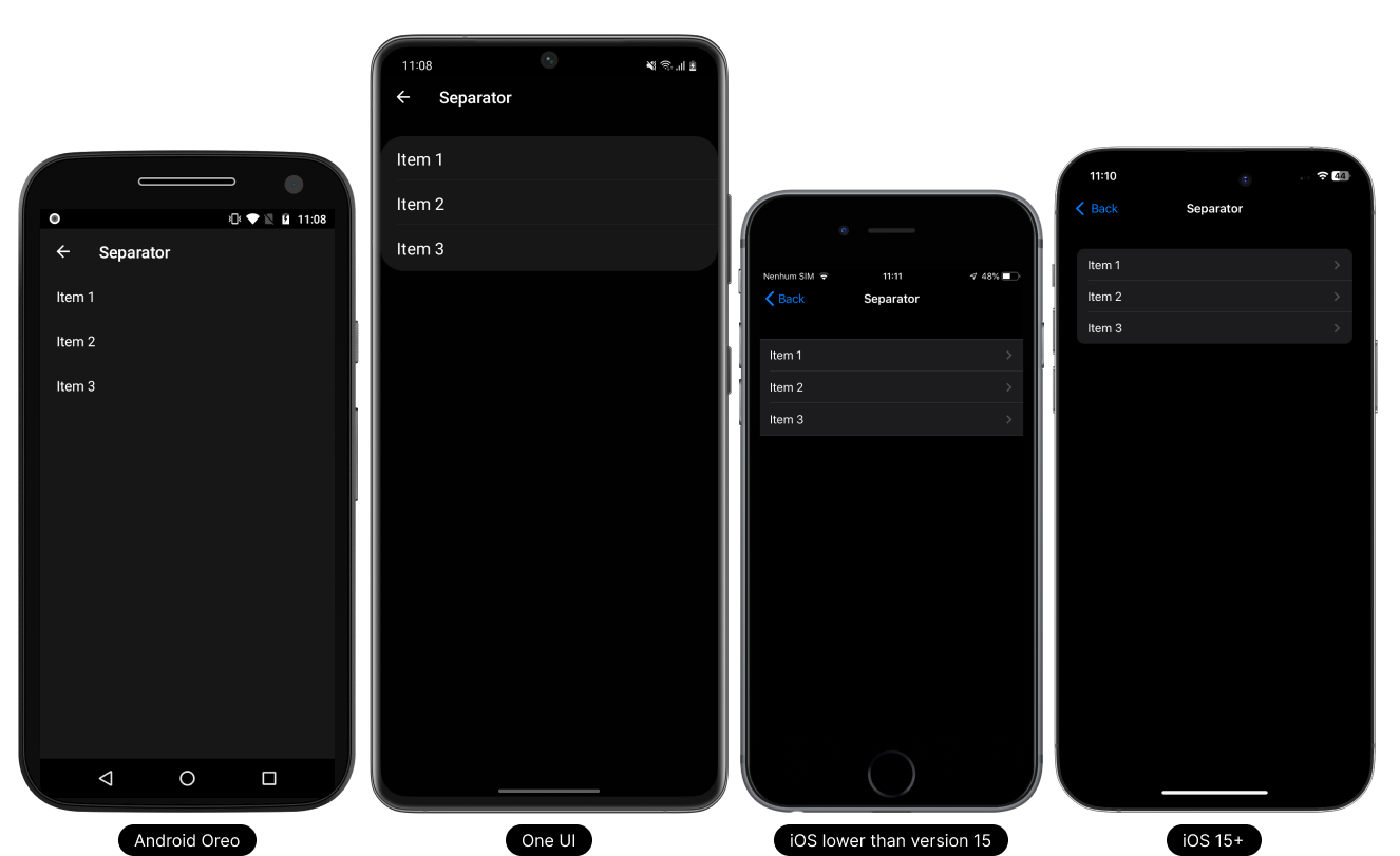
- Light Theme
- Dark Theme

Usage
On the flatlist
This component can be used in the FlatList component.
import React, { useState } from 'react';
import { FlatList, Platform } from 'react-native';

// React Native UI DevKit
import { Item, Separator } from 'react-native-ui-devkit';

const App = () => {
    const [data, setData] = useState([
        { _id: 1, title: 'Item 1' },
        { _id: 2, title: 'Item 2' },
        { _id: 3, title: 'Item 3' }
    ]);

    const renderItem = ({ item, index, separators }) => {
        data[index].separators = separators;

        return (
            <Item
                data={{
                    title: item.title,
                    separator: {
                        data: [data[index - 1], item],
                        index
                    },
                    onPress: () => { }
                }}
                index={index}
                count={data.length}
            />
        )
    }

    return (
        <FlatList
            style={{ backgroundColor: '#efefef' }}
            data={data}
            keyExtractor={({ _id }, index) => String(_id)}
            ItemSeparatorComponent={(props) => { return <Separator props={props} start={Platform.OS == 'ios' ? 15 : 20} />; }}
            renderItem={renderItem}
        />
    );
}

export default App;
Props
props
Receives the ItemSeparatorComponent props from a FlatList.
Type:
object
start
Defines where the division will start.
Type:
number
end
Defines where the division will end.
Type:
number
expanded
If you want to expand the separator, set it to true.
On iOS < 15 is already set as default, so it has no effect.
Type:
boolean
tabletIpadMenuType
Defines whether the separator will have the characteristics of a navigation menu style item.
Supports iPad and Tablet only.
Type:
boolean