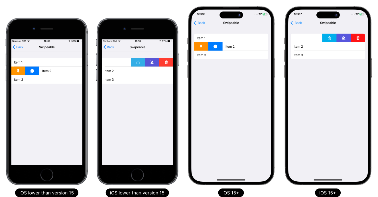
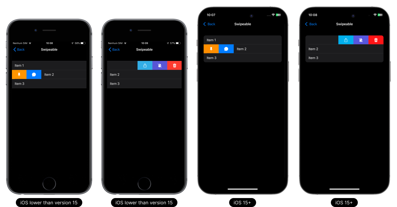
Swipeable (iOS)
Set a slider item to either left or right on iOS.
- Light Theme
- Dark Theme
Usage
On the flatlist
This component can be used in the FlatList component.
This component can be used in the list that has a rendering limit of up to 10 items. If you need to implement it in a dynamic list, use the FlatList component.
- TypeScript
- JavaScript
import React, { useState } from 'react';
import { Alert, FlatList, Platform, View } from 'react-native';

// React Native UI DevKit
import { Item, ISwipeableProps, Separator, Divider } from 'react-native-ui-devkit';

let lastOpened: number = -1;
const App = () => {
  const [data, setData] = useState([
    { _id: 1, title: 'Item 1' },
    { _id: 2, title: 'Item 2' },
    { _id: 3, title: 'Item 3' }
  ]);

  const closeLastOpened = (index: number) => {
    lastOpened != index && data[lastOpened]?.ref?.closeActions();
    lastOpened = index;
  }

  const _render = ({ item, index, separators }) => {
    data[index].separators = separators;

    const _item: ISwipeableProps = {
      title: item.title,
      separator: {
        data: [data[index - 1], item],
        index
      },
      swipeable: {
        left: [
          {
            icon: { name: 'pin', type: 'material-community', color: '#fff', size: 22 },
            backgroundColor: '#FF9500',
            onPress: () => {
              item.ref?.hideItem && item.ref?.hideItem(() => {
                data.splice(index, 1);
                setData([...data]);
              }, 'left');
            }
          },
          {
            icon: { name: 'chatbubble-sharp', type: 'ionicons', color: '#fff', size: 22 },
            backgroundColor: '#007AFF',
            onPress: () => Alert.alert('Warning', 'Left Item 2'),
          },
        ],
        right: [
          {
            icon: { name: 'trash', type: 'ionicons', color: '#fff', size: 22 },
            backgroundColor: '#FF3B30',
            onPress: () => {
              Alert.alert('Warning', 'Right Item 1', [
                {
                  text: 'Cancel',
                  onPress: () => { }
                },
                {
                  text: 'Ok',
                  onPress: async () => {
                    item.ref?.hideItem && item.ref?.hideItem(() => {
                      data.splice(index, 1);
                      setData([...data]);
                    }, 'right');
                  }
                }
              ]);
            },

          },
          {
            icon: { name: 'bell-off', type: 'material-community', color: '#fff', size: 22 },
            backgroundColor: '#5856D6',
            onPress: () => { Alert.alert('Warning', 'Right Item 2'); }
          },
          {
            icon: { name: 'share-outline', type: 'ionicons', color: '#fff', size: 22 },
            backgroundColor: '#32ADE6',
            onPress: () => { Alert.alert('Warning', 'Right Item 3'); }
          }
        ],
        onBegan: () => {
          closeLastOpened(index);
        }
      },
      onPress: async () => { }
    };

    return (
      <Item ref={(ref) => item.ref = ref} key={item._id} data={_item} index={index} count={data.length} />
    )
  }

  return (
    <View style={{ flex: 1 }}>
      <FlatList
        data={data}
        renderItem={_render}
        ItemSeparatorComponent={(props) => { return <Separator props={props} start={Platform.OS == 'ios' ? 15 : 20} /> }}
        onScrollBeginDrag={() => { closeLastOpened(-1); }}
        ListFooterComponent={<Divider />}
      />
    </View >
  );
}

export default App;
import React, { useState } from 'react';
import { Alert, FlatList, Platform, View } from 'react-native';

// React Native UI DevKit
import { Item, Separator, Divider } from 'react-native-ui-devkit';

let lastOpened: number = -1;
const App = () => {
  const [data, setData] = useState([
    { _id: 1, title: 'Item 1' },
    { _id: 2, title: 'Item 2' },
    { _id: 3, title: 'Item 3' }
  ]);

  const closeLastOpened = (index: number) => {
    lastOpened != index && data[lastOpened]?.ref?.closeActions();
    lastOpened = index;
  }

  const _render = ({ item, index, separators }) => {
    data[index].separators = separators;

    const _item = {
      title: item.title,
      separator: {
        data: [data[index - 1], item],
        index
      },
      swipeable: {
        left: [
          {
            icon: { name: 'pin', type: 'material-community', color: '#fff', size: 22 },
            backgroundColor: '#FF9500',
            onPress: () => {
              item.ref?.hideItem && item.ref?.hideItem(() => {
                data.splice(index, 1);
                setData([...data]);
              }, 'left');
            }
          },
          {
            icon: { name: 'chatbubble-sharp', type: 'ionicons', color: '#fff', size: 22 },
            backgroundColor: '#007AFF',
            onPress: () => Alert.alert('Warning', 'Left Item 2'),
          },
        ],
        right: [
          {
            icon: { name: 'trash', type: 'ionicons', color: '#fff', size: 22 },
            backgroundColor: '#FF3B30',
            onPress: () => {
              Alert.alert('Warning', 'Right Item 1', [
                {
                  text: 'Cancel',
                  onPress: () => { }
                },
                {
                  text: 'Ok',
                  onPress: async () => {
                    item.ref?.hideItem && item.ref?.hideItem(() => {
                      data.splice(index, 1);
                      setData([...data]);
                    }, 'right');
                  }
                }
              ]);
            },

          },
          {
            icon: { name: 'bell-off', type: 'material-community', color: '#fff', size: 22 },
            backgroundColor: '#5856D6',
            onPress: () => { Alert.alert('Warning', 'Right Item 2'); }
          },
          {
            icon: { name: 'share-outline', type: 'ionicons', color: '#fff', size: 22 },
            backgroundColor: '#32ADE6',
            onPress: () => { Alert.alert('Warning', 'Right Item 3'); }
          }
        ],
        onBegan: () => {
          closeLastOpened(index);
        }
      },
      onPress: async () => { }
    };

    return (
      <Item ref={(ref) => item.ref = ref} key={item._id} data={_item} index={index} count={data.length} />
    )
  }

  return (
    <View style={{ flex: 1 }}>
      <FlatList
        data={data}
        renderItem={_render}
        ItemSeparatorComponent={(props) => { return <Separator props={props} start={Platform.OS == 'ios' ? 15 : 20} /> }}
        onScrollBeginDrag={() => { closeLastOpened(-1); }}
        ListFooterComponent={<Divider />}
      />
    </View >
  );
}

export default App;
Props
data
This property receives an interface for configuring the swipeable.
Type:
ISwipeableProps
header (optional)
Inserts a native header into the Item. For use on Android, set headerOnAndroid equal to true.
Type:
string
headerOnAndroid (optional)
If you want to render the header on Android, set it to true.
Only supported Android.
Type:
boolean
headerToTitle (optional)
If used, it will replace the item title with the header, if any.
Only supported Android.
Type:
boolean
footer (optional)
Inserts a native footer into the Item. For use on Android, set footerOnAndroid equal to true.
Type:
string
footerOnAndroid (optional)
If you want to render the footer on Android, set it to true.
Only supported Android.
Type:
boolean
tabletIpadMenuType (optional)
Defines whether the item will have the characteristics of a Tablet or iPad navigation menu style item.
Supports Tablet and iPad only.
Type:
boolean
index (optional)
Sets the index of an item. It can be used to join items together to form a list. Used in conjunction with count.
Only supported In the item.
Type:
count
count (optional)
Defines when items have a certain list. Used in conjunction with index.
Only supported In the item.
Type:
number
style (optional)
Set a custom style for the item.
Type:
ViewStyle
flex (optional)
Defines the main view of the item with style flex 1.
Only supported In the item.
Type:
boolean
marginTop (optional)
The marginTop is set by default according to each platform and version, to remove it simply set it to false.
Type:
boolean
separators (optional)
To remove the item's native top and bottom separator, set it to false.
Only supported iOS < 15.
Type:
boolean
expanded (optional)
If you want to expand the item, set it to true. On iOS < 15 is already set as default, so it has no effect.
Type:
boolean
Methods
openLeftActions (iOS)
Method responsible for opening the swipeable from left to right.
Type: async () => void
openRightActions (iOS)
Method responsible for opening the swipeable from right to left.
Type: async () => void
closeActions (iOS)
Method responsible for closing the swipeable both left and right.
Type: async () => void
hideItem (iOS)
Method responsible for creating the transaction to hide the item after executing the swipeable.
Type: (async () => void, side: 'left' | 'right') => void
Interface
ISwipeableProps
This interface receives parameter data and values for swipeable configuration.
Type:
object
iconDefines the icon to be used on the item.
Type:
icontitleDefines the title to be used on the item.
Type:
stringdescriptionDefines the description to be used on the item. The behavior of this property follows the native standard for each platform, Android / iOS.
Type:
stringsubdescriptioniOSSimilar to description rendering on Android.
Type:
stringcomponentDefines a custom component in place of the item.
Type:
ReactNodedisabledDisable the item.
Type:
booleanloadingSets the item as loading and disables it. If the item is of type action, collapsible, switch, checkbox or radio, it will be replaced with an activity indicator.
Type:
booleanpaddingThe item padding comes by default according to each platform, if you want to remove the padding just change it to false.
Type:
booleanbadgeDefines a small circle that displays a number or text and will be displayed on the right side of the item.
Type:
badgecolorSets the color of the item title and description.
The color in the description is only compatible with Android.Type:
colorseparatorSets the separator properties of the above item.
Type:
separatorstyleSet a custom style for the item on the list.
Type:
ViewStyleswipeableiOSConfigure up to 3 actions on the left side and up to 3 actions on the right side.
Type:
swipeableonPressPerforming an action when clicking the button.
Type: async () => void
onLongPressPerforming an action by holding down the button.
Type: async () => void
Type Definitions
icon
Defines the icon to be used on the item.
Type:
object
{
  name: string, // Defines the icon name.
  type: "antdesign" | "entypo" | "evilicons" | "feather" | "font-awesome" | "font-awesome5" | "font-awesome5pro" | "fontisto" | "foundation" | "ionicons" | "material-community" | "material" | "octicons" | "simplelineicons" | "zocial" | "sfsymbol", // Sets the icon type.
  size: number, // Sets the icon size.
  color: string, // Sets the icon color.
  backgroundColor: string, // Sets the background color of the icon.
  component: ReactNode // Defines a custom component in place of the icon.
}
badge
Defines a small circle that displays a number or text and will be displayed on the right side of the item.
Type:
object
{
  value: string, // Determines the value to be printed inside the badge.
  // Setting text and badge colors
  color: {
    text: string, // Sets the text color
    badge: string // Sets the badge color
  }
}
color
Sets the color of the item title and description.
The color in the description is only compatible with Android.Type:
object
{
  title: string, // Sets the color of the item title.
  description: string // Sets the color of the item description. Only supported Android.
}
separator
Sets the separator properties of the above item.
Type:
object
{
  start: number, // Defines where the separator will start.
  index: number, // Used in conjunction with FlatList, it receives the index of the item in question.
  data: [{}, {}] // Used in conjunction with FlatList, it receives an array of 2 items. The first item must be the previous item in the FlatList, and the second item must be the Item in question.
}
swipeable
onfigure up to 3 actions on the left side and up to 3 actions on the right side.
Type:
object
{
  // Set up to 3 actions on the left side for swiping.
  left: [{
    // Defines the icon to be used on the swipeable.
    icon: {
      name: string, // Defines the icon name.
      type: "antdesign" | "entypo" | "evilicons" | "feather" | "font-awesome" | "font-awesome5" | "font-awesome5pro" | "fontisto" | "foundation" | "ionicons" | "material-community" | "material" | "octicons" | "simplelineicons" | "zocial" | "sfsymbol", // Sets the icon type.
      size: number, // Sets the icon size.
      color: string, // Sets the icon color.
      component: ReactNode // Defines a custom component in place of the icon.
    },
    backgroundColor: string, // Sets the background color of the swipeable.
    closeOnPress: boolean, // Sets the slider to close when clicked.
    onPress: async () => void // Performing an action when clicking the swipeable. @returns void
  }],
  // Set up to 3 actions on the right side for swiping.
  right: [{
    // Defines the icon to be used on the swipeable.
    icon: {
    name: string, // Defines the icon name.
      type: "antdesign" | "entypo" | "evilicons" | "feather" | "font-awesome" | "font-awesome5" | "font-awesome5pro" | "fontisto" | "foundation" | "ionicons" | "material-community" | "material" | "octicons" | "simplelineicons" | "zocial" | "sfsymbol", // Sets the icon type.
      size: number, // Sets the icon size.
      color: string, // Sets the icon color.
      component: ReactNode // Defines a custom component in place of the icon.
    },
    backgroundColor: string, // Sets the background color of the swipeable.
    closeOnPress: boolean, // Sets the slider to close when clicked.
    onPress: async () => void // Performing an action when clicking the swipeable. @returns void
  }],
  byMethod: boolean, // Determines whether sliding can only occur through the openLeftActions or
  heightEffect: number, // Sets the height of the effect,
  onBegan: async () => void // Performing an action when clicking the swipeable item. @returns void
}