Icon
This component allows you to easily incorporate icons into your user interface. It supports popular icon libraries like "react-native-vector-icons" and "react-native-sfSymbols," making it simple to add and customize icons in your app for a polished look and feel.
- Light Theme
- Dark Theme

Usage
import React from "react";

// React Native UI DevKit
import { Icon } from "react-native-ui-devkit";

const App = () => {
    return (<Icon name='home' type='antdesign' size={23} color={'#000000'} />)
};

export default App;
Props
name
Defines the icon name.
See the gallery at react-native-vector-icons directoryIf you are using
sfsymbolsin the icontype, you must enter the name through SF Symbols on Mac OSType:
string
type
This property receives an interface for configuring the item.
Type:
string
antdesignAntDesign by AntFinance (298 icons)
Type:
stringentypoEntypo by Daniel Bruce (v1.0.1 411 icons)
Type:
stringeviliconsEvil Icons by Alexander Madyankin & Roman Shamin (v1.10.1, 70 icons)
Type:
stringfeatherFeather by Cole Bemis & Contributors (v4.28.0, 286 icons)
Type:
stringfont-awesomeFont Awesome by Dave Gandy (v4.7.0, 675 icons)
Type:
stringfont-awesome5Font Awesome 5 by Fonticons, Inc. (v5.15.3, 1598 (free) 7848 (pro) icons)
Type:
stringfont-awesome5proFont Awesome 5 Pro
Type:
stringfontistoFontisto by Kenan Gündoğan (v3.0.4, 615 icons)
Type:
stringfoundationFoundation by ZURB, Inc. (v3.0, 283 icons)
Type:
stringioniconsIonicons by Ionic (v7.1.0, 1338 icons)
Type:
stringmaterialMaterial by Google, Inc. (v4.0.0, 2189 icons)
Type:
stringmaterial-communityMaterial Community by MaterialDesignIcons.com (v6.5.95, 6596 icons)
Type:
stringocticonsOcticons by Github, Inc. (v16.3.1, 250 icons)
Type:
stringzocialZocial by Sam Collins (v1.4.0, 100 icons)
Type:
stringsimplelineiconsSimple Line Icons by Sabbir & Contributors (v2.5.5, 189 icons)
Type:
stringsfsymboliOS 15+SF Symbols by Apple (v4.0, 4.491 icons)
Type:
string
size (optional)
Sets the icon size.
Type:
number
color (optional)
Sets the icon color.
Type:
string
animation (optional)
Defines the type of animation.
Type:
bounceflashjellopulserotaterubberBandshakeswingtadawobblebounceInbounceInDownbounceInUpbounceInLeftbounceInRightbounceOutbounceOutDownbounceOutUpbounceOutLeftbounceOutRightfadeInfadeInDownfadeInDownBigfadeInUpfadeInUpBigfadeInLeftfadeInLeftBigfadeInRightfadeInRightBigfadeOutfadeOutDownfadeOutDownBigfadeOutUpfadeOutUpBigfadeOutLeftfadeOutLeftBigfadeOutRightfadeOutRightBigflipInXflipInYflipOutXflipOutYlightSpeedInlightSpeedOutslideInDownslideInUpslideInLeftslideInRightslideOutDownslideOutUpslideOutLeftslideOutRightzoomInzoomInDownzoomInUpzoomInLeftzoomInRightzoomOutzoomOutDownzoomOutUpzoomOutLeftzoomOutRight
iterationCount (optional)
Sets the animation loop.
Type:
numberinfinite
style (optional)
Set a custom style for the icon.
Type:
ViewStyle
weight (optional)
Sets the icon weight.
Only supported iOS.
Type:
SymbolWeight
scale (optional)
Sets the icon scale.
Only supported iOS.
Type:
SymbolScale
resizeMode (optional)
Sets the icon resizeMode.
Only supported iOS.
Type:
SymbolResizeMode
multicolor (optional)
Sets the icon multicolor.
Only supported iOS.
Type:
boolean
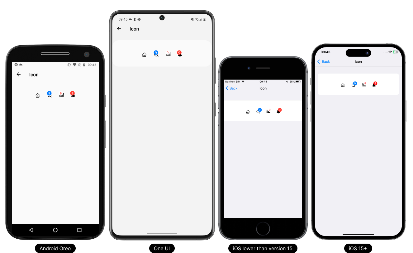
badge (optional)
Defines a small circle that displays a number or text and will be displayed on the right side of the item.
Type:
IBadge
Type Definitions
badge
Defines a small circle that displays a number or text and will be displayed on the right side of the item.
Type:
object
{
  value: string, // Determines the value to be printed inside the badge.
  // Setting text and badge colors
  color: {
    text: string, // Sets the text color
    badge: string // Sets the badge color
  }
}