Item
The item is the basis for creating any component, see all possible properties, parameters and values.
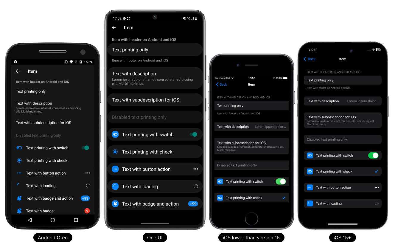
- Light Theme
- Dark Theme

Usage
- TypeScript
- JavaScript
import React from 'react';

// React Native UI DevKit
import { Item, IItemProps } from 'react-native-ui-devkit';

const App = () => {
  const _item: IItemProps = {
    title: 'Item',
    onPress: async () => { }
  };

  return (
    <Item data={_item} />
  );
}

export default App;
import React from 'react';

// React Native UI DevKit
import { Item } from 'react-native-ui-devkit';

const App = () => {
  const _item = {
    title: 'Item',
    onPress: async () => { }
  };

  return (
    <Item data={_item} />
  );
}

export default App;
Props
data
This property receives an interface for configuring the item.
Type:
IItemProps
header (optional)
Inserts a native header into the Item. For use on Android, set headerOnAndroid equal to true.
Type:
string
headerOnAndroid (optional)
If you want to render the header on Android, set it to true.
Type:
boolean
headerToTitle (optional)
If used, it will replace the item title with the header, if any. Only supported Android.
Type:
boolean
footer (optional)
Inserts a native footer into the Item. For use on Android, set footerOnAndroid equal to true.
Type:
string
footerOnAndroid (optional)
If you want to render the footer on Android, set it to true.
Only supported Android.
Type:
boolean
tabletIpadMenuType (optional)
Defines whether the item will have the characteristics of a Tablet or iPad navigation menu style item.
Supports Tablet and iPad only.
Type:
boolean
index (optional)
Sets the index of an item. It can be used to join items together to form a list. Used in conjunction with count.
Type:
count
count (optional)
Defines when items have a certain list. Used in conjunction with index.
Type:
number
style (optional)
Set a custom style for the item.
Type:
ViewStyle
flex (optional)
Defines the main view of the item with style flex 1.
Type:
boolean
marginTop (optional)
The marginTop is set by default according to each platform and version, to remove it simply set it to false.
Type:
boolean
separators (optional)
To remove the item's native top and bottom separator, set it to false.
Only supported iOS < 15.
Type:
boolean
expanded (optional)
If you want to expand the item, set it to true. On iOS < 15 is already set as default, so it has no effect.
Type:
boolean
Methods
openLeftActions (iOS)
Method responsible for opening the swipeable from left to right.
Type: async () => void
openRightActions (iOS)
Method responsible for opening the swipeable from right to left.
Type: async () => void
closeActions (iOS)
Method responsible for closing the swipeable both left and right.
Type: async () => void
hideItem (iOS)
Method responsible for creating the transaction to hide the item after executing the swipeable.
Type: (async () => void, side: 'left' | 'right') => void
Interface
IItemProps
This interface receives parameter data and values for item configuration.
Type:
object
iconDefines the icon to be used on the item.
Type:
icontitleDefines the title to be used on the item.
Type:
stringdescriptionDefines the description to be used on the item. The behavior of this property follows the native standard for each platform, Android / iOS.
Type:
stringsubdescriptioniOSSimilar to description rendering on Android.
Type:
stringcomponentDefines a custom component in place of the item.
Type:
ReactNodedisabledDisable the item.
Type:
booleanloadingSets the item as loading and disables it. If the item is of type action, collapsible, switch, checkbox or radio, it will be replaced with an activity indicator.
Type:
booleanchevroniOSBy default it is true, if you want to hide it just set it to false.
Type:
booleandelayiOSThe delay after the click event is defaulted, if you want to remove the delay just set it to false.
Type:
booleancollapsibleDefines whether the item is a collapsible item.
Type:
booleanpaddingThe item padding comes by default according to each platform, if you want to remove the padding just change it to false.
Type:
booleanbadgeDefines a small circle that displays a number or text and will be displayed on the right side of the item.
Type:
badgecolorSets the color of the item title and description.
The color in the description is only compatible with Android.Type:
colorcheckboxDefines whether the item is a checkbox item.
By default it is null, if you want to mark it just set it to false or true.Type:
booleanradioDefines whether the item is a radio item.
By default it is null, if you want to mark it just set it to false or true.Type:
booleanseparatorSets the separator properties of the above item.
Type:
separatorcleanerUsed in conjunction with TextInput, defines whether a clear button will appear according to each platform on the right side of the item.
Type:
cleanersuccessFeatures a standard success icon on the right side of the item.
Type:
successalertFeatures a standard alert icon on the right side of the item.
Type:
alertswitchDefines whether the item is a switch item.
Type:
switchactionDefines whether the item is a action item.
On iOS it is disabled by default. To use, simply set iOS to true.Type:
actionswipeableiOSConfigure up to 3 actions on the left side and up to 3 actions on the right side.
Type:
swipeableonPressPerforming an action when clicking the button.
Type: async () => void
onLongPressPerforming an action by holding down the button.
Type: async () => void
Type Definitions
icon
Defines the icon to be used on the item.
Type:
object
{
  name: string, // Defines the icon name.
  type: "antdesign" | "entypo" | "evilicons" | "feather" | "font-awesome" | "font-awesome5" | "font-awesome5pro" | "fontisto" | "foundation" | "ionicons" | "material-community" | "material" | "octicons" | "simplelineicons" | "zocial" | "sfsymbol", // Sets the icon type.
  size: number, // Sets the icon size.
  color: string, // Sets the icon color.
  backgroundColor: string, // Sets the background color of the icon.
  component: ReactNode // Defines a custom component in place of the icon.
}
badge
Defines a small circle that displays a number or text and will be displayed on the right side of the item.
Type:
object
{
  value: string, // Determines the value to be printed inside the badge.
  // Setting text and badge colors
  color: {
    text: string, // Sets the text color
    badge: string // Sets the badge color
  }
}
color
Sets the color of the item title and description.
The color in the description is only compatible with Android.Type:
object
{
  title: string, // Sets the color of the item title.
  description: string // Sets the color of the item description. Only supported Android.
}
separator
Sets the separator properties of the above item.
Type:
object
{
  start: number, // Defines where the separator will start.
  index: number, // Used in conjunction with FlatList, it receives the index of the item in question.
  data: [{}, {}] // Used in conjunction with FlatList, it receives an array of 2 items. The first item must be the previous item in the FlatList, and the second item must be the Item in question.
}
cleaner
Used in conjunction with TextInput, defines whether a clear button will appear according to each platform on the right side of the item.
Type:
object
{
  visible: boolean, // Defines whether the button is visible.
  onPress: async () => void // Performing an action when clicking the button. @returns void
}
success
Features a standard success icon on the right side of the item.
Type:
object
{
  visible: boolean, // Defines whether the icon is visible.
  color: string // Sets the icon color.
}
alert
Features a standard alert icon on the right side of the item.
Type:
object
{
  visible: string, // Defines whether the icon is visible.
  color: string // Sets the icon color.
}
switch
Defines whether the item is a switch item.
Type:
object
{
  value: boolean, // Sets the switch value.
  disabled: boolean, // Set the switch to disabled.
  onValueChange: async (value: boolean) => void // Performs an action on value change. @returns void
}
action
Defines whether the item is a action item.
On iOS it is disabled by default. To use, simply set iOS to true.Type:
object
{
  // Defines the icon to be used on the action.
  icon: {
    name: string, // Defines the icon name.
    type: "antdesign" | "entypo" | "evilicons" | "feather" | "font-awesome" | "font-awesome5" | "font-awesome5pro" | "fontisto" | "foundation" | "ionicons" | "material-community" | "material" | "octicons" | "simplelineicons" | "zocial" | "sfsymbol", // Sets the icon type.
    size: number, // Sets the icon size.
    color: string, // Sets the icon color.
    component: ReactNode // Defines a custom component in place of the icon.
  },
  iOS: boolean, // If you want to render the action on iOS, set it to true. Only supported iOS.
  onPress: async () => void // Performing an action when clicking the button. @returns void
}
swipeable
onfigure up to 3 actions on the left side and up to 3 actions on the right side.
Type:
object
{
  // Set up to 3 actions on the left side for swiping.
  left: [{
    // Defines the icon to be used on the swipeable.
    icon: {
      name: string, // Defines the icon name.
      type: "antdesign" | "entypo" | "evilicons" | "feather" | "font-awesome" | "font-awesome5" | "font-awesome5pro" | "fontisto" | "foundation" | "ionicons" | "material-community" | "material" | "octicons" | "simplelineicons" | "zocial" | "sfsymbol", // Sets the icon type.
      size: number, // Sets the icon size.
      color: string, // Sets the icon color.
      component: ReactNode // Defines a custom component in place of the icon.
    },
    backgroundColor: string, // Sets the background color of the swipeable.
    closeOnPress: boolean, // Sets the slider to close when clicked.
    onPress: async () => void // Performing an action when clicking the swipeable. @returns void
  }],
  // Set up to 3 actions on the right side for swiping.
  right: [{
    // Defines the icon to be used on the swipeable.
    icon: {
    name: string, // Defines the icon name.
      type: "antdesign" | "entypo" | "evilicons" | "feather" | "font-awesome" | "font-awesome5" | "font-awesome5pro" | "fontisto" | "foundation" | "ionicons" | "material-community" | "material" | "octicons" | "simplelineicons" | "zocial" | "sfsymbol", // Sets the icon type.
      size: number, // Sets the icon size.
      color: string, // Sets the icon color.
      component: ReactNode // Defines a custom component in place of the icon.
    },
    backgroundColor: string, // Sets the background color of the swipeable.
    closeOnPress: boolean, // Sets the slider to close when clicked.
    onPress: async () => void // Performing an action when clicking the swipeable. @returns void
  }],
  byMethod: boolean, // Determines whether sliding can only occur through the openLeftActions or
  heightEffect: number, // Sets the height of the effect,
  onBegan: async () => void // Performing an action when clicking the swipeable item. @returns void
}