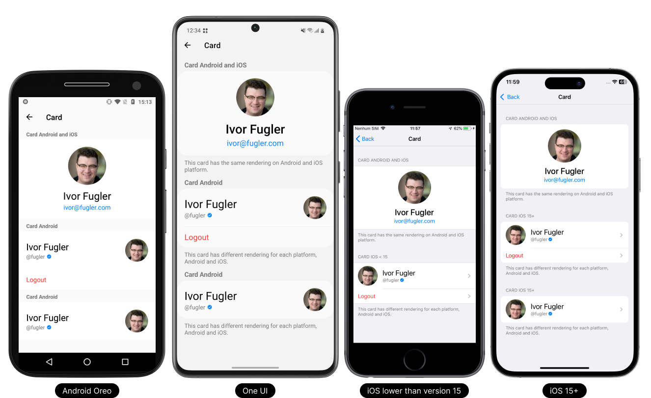
Card
A card can be generated using the component property in the data of the List or Item.
You can find these cards and all other ready-made components in our library.
- Light Theme
- Dark Theme

Usage
On the list
This component can be used in the list that has a rendering limit of up to 10 items. If you need to implement it in a dynamic list, use the FlatList component.
- TypeScript
- JavaScript
import React from 'react';
import { Text, View } from 'react-native';

// React Native UI DevKit
import { List, ICardProps } from 'react-native-ui-devkit';

const App = () => {
  const _list: Array<ICardProps> = [
    {
      component: (
        <View>
          <Text>Card 1</Text>
        </View>
      ),
      onPress: async () => { }
    },
    {
      component: (
        <View>
          <Text>Card 2</Text>
        </View>
      ),
      onPress: async () => { }
    }
  ];

  return (
    <List data={_list} />
  );
}

export default App;
import React from 'react';
import { Text, View } from 'react-native';

// React Native UI DevKit
import { List } from 'react-native-ui-devkit';

const App = () => {
  const _list = [
    {
      component: (
        <View>
          <Text>Card 1</Text>
        </View>
      ),
      onPress: async () => { }
    },
    {
      component: (
        <View>
          <Text>Card 2</Text>
        </View>
      ),
      onPress: async () => { }
    }
  ];

  return (
    <List data={_list} />
  );
}

export default App;
In the item
This component can be used individually in the item.
- TypeScript
- JavaScript
import React from 'react';
import { Text, View } from 'react-native';

// React Native UI DevKit
import { Item, ICardProps } from 'react-native-ui-devkit';

const App = () => {
  const _item: ICardProps = {
    component: (
      <View>
        <Text>Card</Text>
      </View>
    ),
    chevron: false,
    onPress: async () => { }
  };

  return (
    <Item data={_item} />
  );
}

export default App;
import React from 'react';
import { Text, View } from 'react-native';

// React Native UI DevKit
import { Item } from 'react-native-ui-devkit';

const App = () => {
  const _item = {
    component: (
      <View>
        <Text>Card</Text>
      </View>
    ),
    chevron: false,
    onPress: async () => { }
  };

  return (
    <Item data={_item} />
  );
}

export default App;
Props
data
This property receives an interface for configuring the card.
Type:
ICardProps
header (optional)
Inserts a native header into the Item. For use on Android, set headerOnAndroid equal to true.
Type:
string
headerOnAndroid (optional)
If you want to render the header on Android, set it to true.
Only supported Android.
Type:
boolean
footer (optional)
Inserts a native footer into the Item. For use on Android, set footerOnAndroid equal to true.
Type:
string
footerOnAndroid (optional)
If you want to render the footer on Android, set it to true.
Only supported Android.
Type:
boolean
tabletIpadMenuType (optional)
Defines whether the item will have the characteristics of a Tablet or iPad navigation menu style item.
Supports Tablet and iPad only.
Type:
boolean
index (optional)
Sets the index of an item. It can be used to join items together to form a list. Used in conjunction with count.
Only supported In the item.
Type:
count
count (optional)
Defines when items have a certain list. Used in conjunction with index.
Only supported In the item.
Type:
number
style (optional)
Set a custom style for the item.
Type:
ViewStyle
flex (optional)
Defines the main view of the item with style flex 1.
Only supported In the item.
Type:
boolean
marginTop (optional)
The marginTop is set by default according to each platform and version, to remove it simply set it to false.
Type:
boolean
separators (optional)
To remove the item's native top and bottom separator, set it to false.
Only supported iOS < 15.
Type:
boolean
expanded (optional)
If you want to expand the item, set it to true. On iOS < 15 is already set as default, so it has no effect.
Type:
boolean
Interface
ICardProps
This interface receives parameter data and values for card configuration.
Type:
object
iconDefines the icon to be used on the item.
Type:
iconcomponentDefines a custom component in place of the item.
Type:
ReactNodedisabledDisable the item.
Type:
booleanchevroniOSThe delay after the click event is defaulted, if you want to remove the delay just set it to false.
Type:
booleandelayiOSThe delay after the click event is defaulted, if you want to remove the delay just set it to false.
Type:
booleanpaddingThe item padding comes by default according to each platform, if you want to remove the padding just change it to false.
Type:
booleanseparatorSets the separator properties of the above item.
Type:
separatorstyleSet a custom style for the item on the list.
Type:
ViewStyleonPressPerforming an action when clicking the button.
Type: async () => void
onLongPressPerforming an action by holding down the button.
Type: async () => void
Type Definitions
icon
Defines the icon to be used on the item.
Type:
object
{
  name: string, // Defines the icon name.
  type: "antdesign" | "entypo" | "evilicons" | "feather" | "font-awesome" | "font-awesome5" | "font-awesome5pro" | "fontisto" | "foundation" | "ionicons" | "material-community" | "material" | "octicons" | "simplelineicons" | "zocial" | "sfsymbol", // Sets the icon type.
  size: number, // Sets the icon size.
  color: string, // Sets the icon color.
  backgroundColor: string, // Sets the background color of the icon.
  component: ReactNode // Defines a custom component in place of the icon.
}
separator
Sets the separator properties of the above item.
Type:
object
{
  start: number, // Defines where the separator will start.
  index: number, // Used in conjunction with FlatList, it receives the index of the item in question.
  data: [{}, {}] // Used in conjunction with FlatList, it receives an array of 2 items. The first item must be the previous item in the FlatList, and the second item must be the Item in question.
}