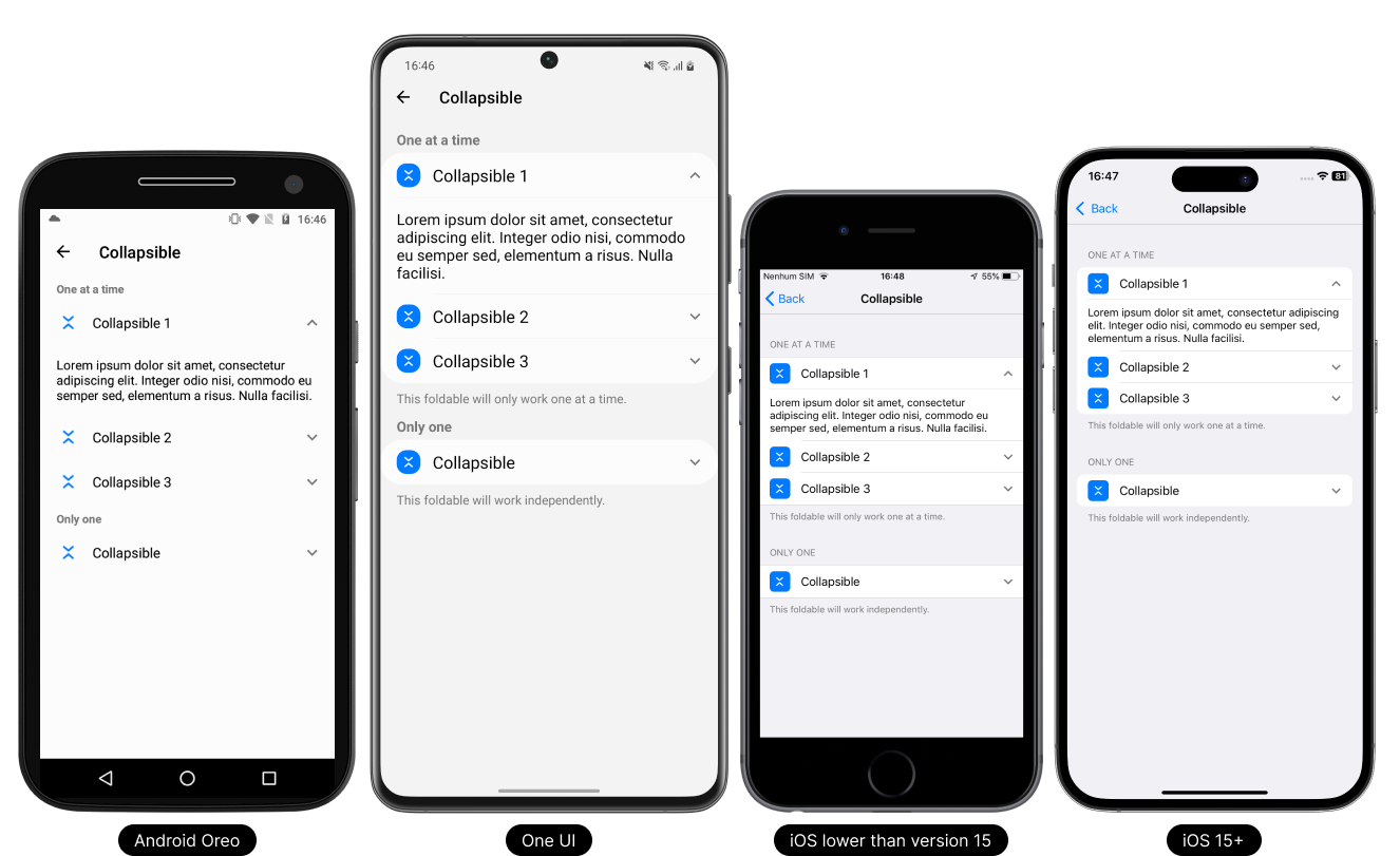
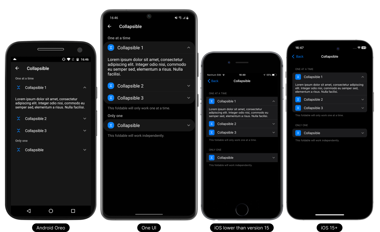
Collapsible
A collapsible item is generated according to each platform.
- Light Theme
- Dark Theme
Usage
On the list
This component can be used in the list that has a rendering limit of up to 10 items. If you need to implement it in a dynamic list, use the FlatList component.
- TypeScript
- JavaScript
import React, { useState } from 'react';
import { Text, View } from 'react-native';

// React Native UI DevKit
import { List, ICollapsibleProps, MediumFontSize } from 'react-native-ui-devkit';

const App = () => {
  const [vars, setVars] = useState({ collapsible: false });

  const _list: Array<ICollapsibleProps> = [
    {
      icon: { name: 'chevron-collapse', type: 'ionicons', size: 18, color: '#FFFFFF', backgroundColor: '#333333' },
      title: 'Collapsible',
      collapsible: vars.collapsible,
      onPress: async () => {
        setVars((prevState) => ({ ...prevState, collapsible: !prevState.collapsible }));
      }
    },
    {
      ...vars.collapsible &&
      {
        component: (
          <View style={{ marginVertical: 10 }}>
            <Text style={[
              MediumFontSize(),
              {
                // your custom style here...
              }
            ]}>Lorem ipsum dolor sit amet, consectetur adipiscing elit. Integer odio nisi, commodo eu semper sed, elementum a risus. Nulla facilisi.</Text>
          </View>
        )
      }
    }
  ];

  return (
    <List data={_list} />
  );
}

export default App;
import React, { useState } from 'react';
import { Text, View } from 'react-native';

// React Native UI DevKit
import { List, MediumFontSize } from 'react-native-ui-devkit';

const App = () => {
  const [vars, setVars] = useState({ collapsible: false });

  const _list = [
    {
      icon: { name: 'chevron-collapse', type: 'ionicons', size: 18, color: '#FFFFFF', backgroundColor: '#333333' },
      title: 'Collapsible',
      collapsible: vars.collapsible,
      onPress: async () => {
        setVars((prevState) => ({ ...prevState, collapsible: !prevState.collapsible }));
      }
    },
    {
      ...vars.collapsible &&
      {
        component: (
          <View style={{ marginVertical: 10 }}>
            <Text style={[
              MediumFontSize(),
              {
                // your custom style here...
              }
            ]}>Lorem ipsum dolor sit amet, consectetur adipiscing elit. Integer odio nisi, commodo eu semper sed, elementum a risus. Nulla facilisi.</Text>
          </View>
        )
      }
    }
  ];

  return (
    <List data={_list} />
  );
}

export default App;
Props
data
This property receives an interface for configuring the item.
Type:
ICollapsibleProps
header (optional)
Inserts a native header into the Item. For use on Android, set headerOnAndroid equal to true.
Type:
string
headerOnAndroid (optional)
If you want to render the header on Android, set it to true.
Only supported Android.
Type:
boolean
headerToTitle (optional)
If used, it will replace the item title with the header, if any.
Only supported Android.
Type:
boolean
footer (optional)
Inserts a native footer into the Item. For use on Android, set footerOnAndroid equal to true.
Type:
string
footerOnAndroid (optional)
If you want to render the footer on Android, set it to true.
Only supported Android.
Type:
boolean
tabletIpadMenuType (optional)
Defines whether the item will have the characteristics of a Tablet or iPad navigation menu style item.
Supports Tablet and iPad only.
Type:
boolean
index (optional)
Sets the index of an item. It can be used to join items together to form a list. Used in conjunction with count.
Only supported In the item.
Type:
count
count (optional)
Defines when items have a certain list. Used in conjunction with index.
Only supported In the item.
Type:
number
style (optional)
Set a custom style for the item.
Type:
ViewStyle
flex (optional)
Defines the main view of the item with style flex 1.
Only supported In the item.
Type:
boolean
marginTop (optional)
The marginTop is set by default according to each platform and version, to remove it simply set it to false.
Type:
boolean
separators (optional)
To remove the item's native top and bottom separator, set it to false.
Only supported iOS < 15.
Type:
boolean
expanded (optional)
If you want to expand the item, set it to true. On iOS < 15 is already set as default, so it has no effect.
Type:
boolean
Interface
ICollapsibleProps
This interface receives parameter data and values for collapsible configuration.
Type:
object
iconDefines the icon to be used on the item.
Type:
icontitleDefines the title to be used on the item.
Type:
stringdescriptionDefines the description to be used on the item. The behavior of this property follows the native standard for each platform, Android / iOS.
Type:
stringsubdescriptioniOSSimilar to description rendering on Android.
Type:
stringcomponentDefines a custom component in place of the item.
Type:
ReactNodedisabledDisable the item.
Type:
booleanloadingSets the item as loading and disables it. If the item is of type action, collapsible, switch, checkbox or radio, it will be replaced with an activity indicator.
Type:
booleancollapsibleDefines whether the item is a collapsible item.
Type:
booleanpaddingThe item padding comes by default according to each platform, if you want to remove the padding just change it to false.
Type:
booleanbadgeDefines a small circle that displays a number or text and will be displayed on the right side of the item.
Type:
badgecolorSets the color of the item title and description.
The color in the description is only compatible with Android.Type:
colorseparatorSets the separator properties of the above item.
Type:
separatorstyleSet a custom style for the item on the list.
Type:
ViewStyleonPressPerforming an action when clicking the button.
Type: async () => void
onLongPressPerforming an action by holding down the button.
Type: async () => void
Type Definitions
icon
Defines the icon to be used on the item.
Type:
object
{
  name: string, // Defines the icon name.
  type: "antdesign" | "entypo" | "evilicons" | "feather" | "font-awesome" | "font-awesome5" | "font-awesome5pro" | "fontisto" | "foundation" | "ionicons" | "material-community" | "material" | "octicons" | "simplelineicons" | "zocial" | "sfsymbol", // Sets the icon type.
  size: number, // Sets the icon size.
  color: string, // Sets the icon color.
  backgroundColor: string, // Sets the background color of the icon.
  component: ReactNode // Defines a custom component in place of the icon.
}
badge
Defines a small circle that displays a number or text and will be displayed on the right side of the item.
Type:
object
{
  value: string, // Determines the value to be printed inside the badge.
  // Setting text and badge colors
  color: {
    text: string, // Sets the text color
    badge: string // Sets the badge color
  }
}
color
Sets the color of the item title and description.
The color in the description is only compatible with Android.Type:
object
{
  title: string, // Sets the color of the item title.
  description: string // Sets the color of the item description. Only supported Android.
}
separator
Sets the separator properties of the above item.
Type:
object
{
  start: number, // Defines where the separator will start.
  index: number, // Used in conjunction with FlatList, it receives the index of the item in question.
  data: [{}, {}] // Used in conjunction with FlatList, it receives an array of 2 items. The first item must be the previous item in the FlatList, and the second item must be the Item in question.
}